So I incorporated the App design as our base look to draw the brand together more, and went from there. Go ahead and and have a poke-round. Visit Lunchquest.
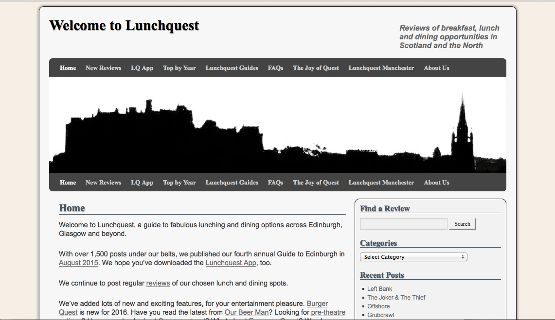
Old Lunchquest homepage. Gone is the vista of Edinburgh in B&W.
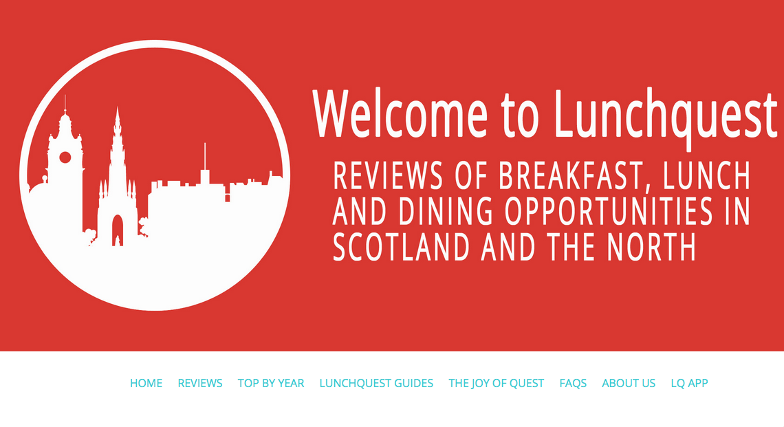
Now the homepage is cleaner, with a simple colour scheme and makes use of our app image, which maintains a coherence.
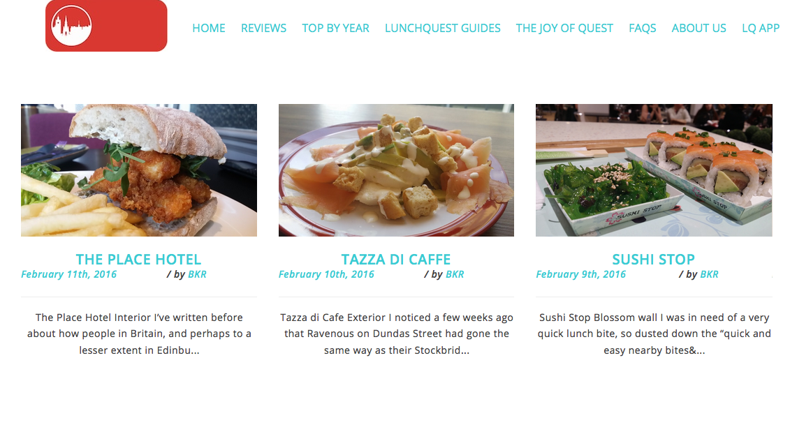
Some improvements are rather simple: like adding in a better way to view the most recent reviews.
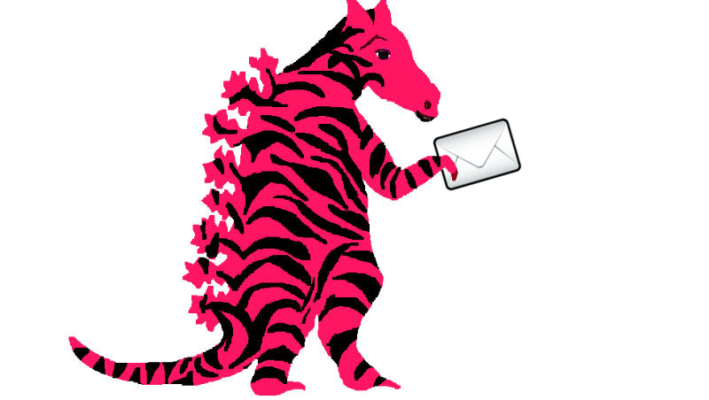
And, of course, this guy: The Dudleytigermailosaurus.
Comments are closed